Followers

Contributors

Thursday, 28 April 2011

Evaluation 4 - How did you use new media technology in the contruction and research, planning and evaluation stages?

Throughout the construction of all three of our ancillary tasks (teaser trailer, film poster and magazine front cover) we applied the use of Digital Technologies shown below.

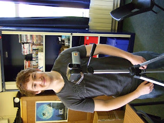
Me with the Camera and Tripod we used:


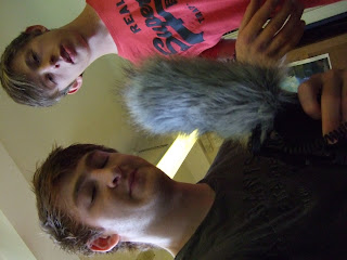
Boom


Adobe Premiere
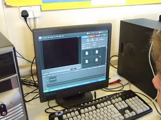


We used Adobe Premiere to edit our teaser trailer. This allowed us to identify the process of selecting and preparing shots and scenes using the effects that the software comes with to emphasise what we were trying to portray.



Adobe Photoshop



Adobe Illustrator



The use of the above programs; Adobe Photoshop and Adobe Illustrator, allowed us to manipulate the images for the magazine cover and poster to enhance the emotion and overall appearance that we wished to present.


Slideshare


We used 'Slideshare' early on in our Research and Planning stages to involve and combine different interactive IT skills.

Youtube
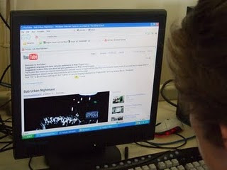


We have used 'Youtube' throughout our foundation and advanced portfolio to both gain audience feedback and use as a free movie uploader, we have also been able to improve our knowledge of teaser trailer elements by viewing other uploaded 'Teaser trailers'.


Blogger


Blogger is a free web-blog publishing tool from Google, used for sharing text, photos and videos. We have used this throughout our foundation and advanced portfolio to publish our work from research and planning to our final edited teaser trailer, teaser posters and film magazine front covers. We have enabled access to anyone worldwide to view and follow our blogs allowing us to recieve any positive or negative feedback via email.


Wednesday, 27 April 2011

Evaluation 3 - What have you learned from your audience feedback


Our audience feedback shown in the videos above has enabled us to hear other peoples opinions on all three of our ancillary tasks, both negative and positive. This allows us to see if we have achieved our intentions and to what extent. It also helps to realise areas that we could improve on, and therefore re look at certain aspects and adjust and edit them, to improve our overall product.

Below shows the comments I have taken from the audience feedback, the vast amount of points displays that this was very beneficial.


Positive

  • Good use of time stretch - manipulation of pace
  • Enigma - making the audience wanting to know more
  • Realistic
  • Pacey
  • Nice Length


Factors to possibly re-visit

  • Punch in face - see if the transition of face to blood trim down
  • Dialogue/ Voice over


Improvements

  • Wider audience


Magazine

  • Good choice of image (different from trailer)
  • Matches colour scheme
  • Right choice of magazine
  • Font matches teaser trailer


Poster

  • Good composition
  • Black and White
  • Portrays sub urbs well

Friday, 8 April 2011

Evaluation 2 - How effective is the combination of your main product and ancillary texts?


the video above is the same as the previous trailer posted. However, i wanted to emphaise the annotions that have been made of the attraction of our product to the target audience.

Evalutation 1 - In what ways does your media product use, develop or challenge forms and conventions of a real media product?


The title of the film has been put in a urban style font, with all letters other than 'i' in capitals. this gives it a gritty look, conforming the the conventions of our genre.

The setting and location can be seen in the pictures, they all have a similar colour scheme which can be seen above in the screen grabs. The setting is generally at night time as well in order to match this colour scheme.

Costumes used are hooded jumpers and coats and jeans or tracksuit bottoms.
Props are the cars and the fake blood.

In the top right image the close up shot has been freeze framed in order to allow the audience to familerise themselves with the actor, this also matches the beat of the soundtrack.
Generally the camerawork was handheld in order to create a more realistic feel, which we thought to fit into the mood of the genre.

All of the titles and intertitles share the same font of poplar, however they all vary in size depending on importance and the amount of text needing to be shown in the shot. For example the film title is a big font in order to fill a large amount of the page whereas the summer 11 intertitle is smaller size.

This story isnt very clear through the viewing of the trailer, therefore there is a high sense of enigma. This is good as a large number of trailers use enigma as a technique of attracting their audience without letting out too much information on the plot.

The genre in British Urban Drama. This is suggested through the trailer through the setting in the club and in the cars. It is also set up by the costume and characters as they have a late teen stereotype which the target audience are intended to belong to.

The characters are introduced:
  • in the club are location which is famous for being an attraction for young people (the audience)
  • on the side of a street, a commonly known place where the stereotyped characters and age group are known for being found
  • the final character is introduced in his car. A known interest of the target audiece as they are all beginning to learn and pass their driving tests.
Special effects are used in a basic standard. An example from on of the screen grabs is the speeding up of the top left image.

Tuesday, 29 March 2011

Final Teaser Trailer

Magazine Front cover.


we chose to use sight and sound magazine, as it is a British magazine, also it generally targets niche films. Therefore we thought it would be perfect for our film. However, the only downside is that sight and sound are not generally know for our particular genre, which may defer their target audience, however perhaps broadening ours.


Final Teaser Poster


Film Title: Sub Urban Nightmare

Tagline: Roll with us or get rolled over

Website: www.suburbannightmarethemovie.co.uk

Annotated Final Poster


PROCESSES

Adding text:


Adding background image:


Adding a tagline:


Playing with the contrast: